
40 Winks foundation - redesign

Project Overview
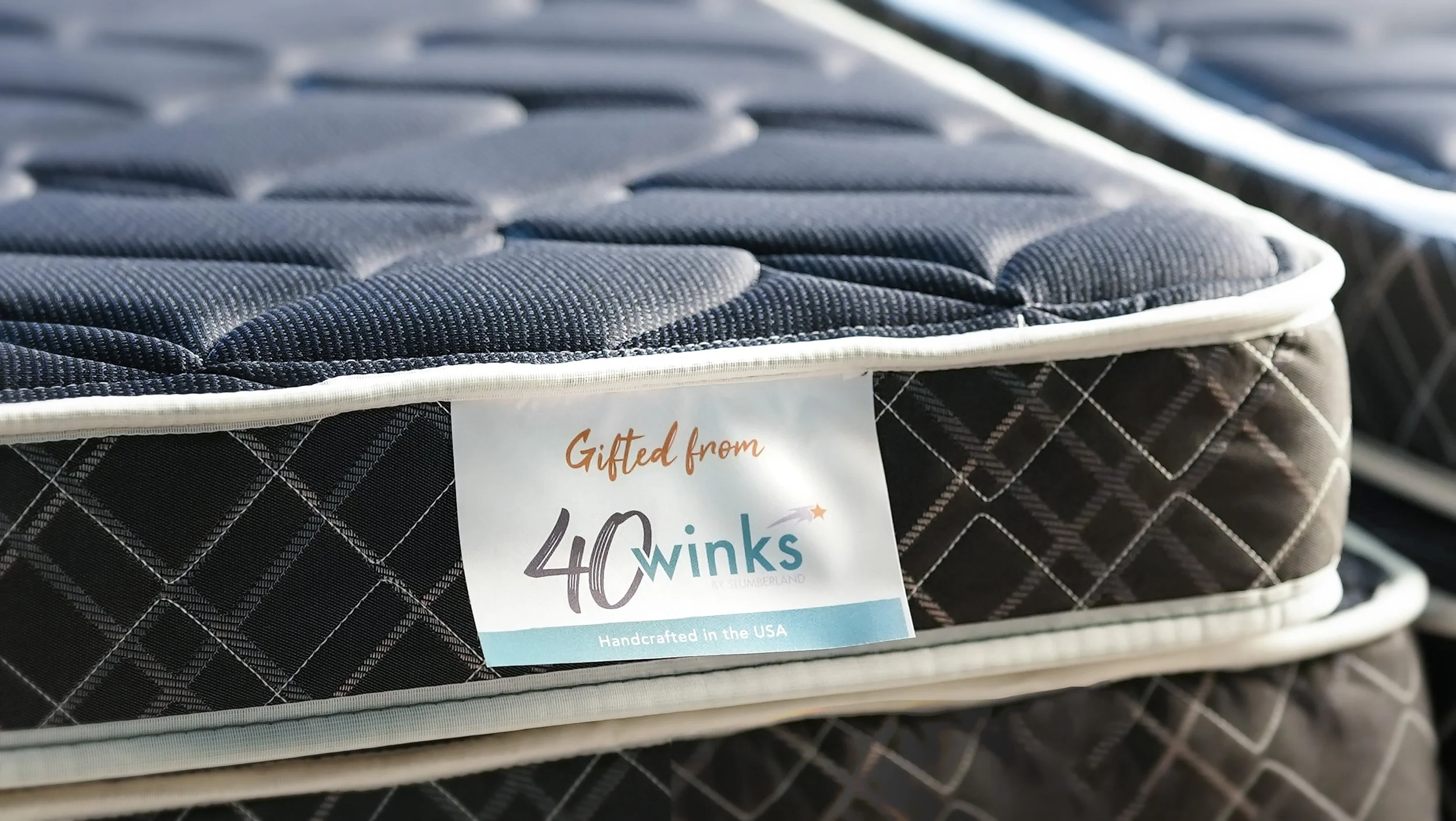
We redesigned the website for 40 Winks which is a non-profit that provides beds for kids in need. We conducted a heuristic evaluation of the current site, competitor analysis, and user interviews to identify what could be improved. We then designed a new version of the website that addressed all of the identified gaps and provided a much improved experience for visitors.
What I Did
This was a highly collaborative effort between myself and 2 other UX designers. Each team member was involved with every step of the process at varying capacities.

The Problem
Visitors to the site and potential donors/partners need a website they can easily make sense of that gives them a feeling of trust and connection with the organization
Heuristic Evaluation
Competitor Analysis
“I love being able to see the impact of my efforts”.
-Potential User


“I need to clearly understand expectations to feel confident enough to get involved”.
-Potential User
Empathizing with potential users
-
User persona

Defining the user journey
Hi-fidelity Prototype
Our most delightful interaction
The responsive “bed meter” provides users with a clear connection between their contributions and the impact it will have on helping kids in need.
Final Thoughts
Our redesign not only showcases the mission, programs, and impact of the non-profit, but also acts as a platform to engage and connect with potential donors, volunteers, and partners.
A visually appealing and user-friendly website can create a positive first impression and build trust, facilitating increased support and donations.
Our hope is that the redesigned website will amplify their reach, engage their audience, and drive positive change in the community.